Finance – S curve example

S-curve examples
About S-curve examples
The S-curve is a staple tool in a project managers toolbox. For a good general overview of S-curves, and how they are used in construction, read this article.
For a quick refresher, an S-curve is simply a graphical display of cumulative quantities plotted over time. These quantities can be for many different 'things' across many different industries including:
- Man-hours
- Dollars (cost)
- Progress
- Production
The S-curve represents the utilisation of these inputs and resources over time. The S-curve is so called because plotting the utilisation of resources over the course of a project typically results in a curve with an S shape.
This S shape forms because projects are typically slower at the start when the project is just getting started (a flatter part of the S), steepest during the middle period of project delivery when there is a hive of activity and progress (the steeper part of the S), and then flatter again towards the end of the project when the project is being closed out, defects are being rectified etc.
The following S-curve examples are designed to give you a quick overview of the different types of S-curves, and how these types are derived from tracking different resources.
No matter how perfect or representative these S-curve examples seem, the S-curve won't always be a perfect S. The shape of your S-curve will differ from resource to resource and project to project - but the theory and idea behind these S-curve examples remains the same.
So let's take a look at some S-curve examples.
S-curve example for performance evaluation
The first S-curve example we are going to look at is one of the most common, and one of the most important. Using S-curves for tracking general project progress is extremely common in industries like construction, oil and gas and mining.
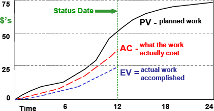
As you can see in the example below, a company or project manager has mapped out and illustrated the planned value or 'expected progress' of the project, from the beginning to end.
A project projection will typically take this form.
You can also see the other two elements of this particular S-curve example are some early S-curves of earned value and actual cost.
As you can see, the status date is the line in the sand with which earned value and actual cost stop, with the project manager looking to understand how the project is tracking compared to our planned value.
The actual cost and earned value S-curve graphs are beginning to follow the trajectory of the planned value, although both lines are beneath the planned value S-curve. This means are earned value and actual costs are below what we had planned - which could mean our schedule and budget at completion weren't well forecasted, or that the project has run into some issues.
In this S-curve example, early signs are that project activity and progress hasn't scaled as quickly as planned, which could be a result of daily production rates, a specific delay, or something else.
You can learn more about earned value management specifically here.

S-curve example for cash flow forecasts
Another strong and common application of the S-curve is for cash flow forecasts. Similar to tracking project progress, the S-curve is applicable to project cash flows because cash typically flows in accordance with progress. In other words, cash flows flow at the same rates as progress; when progress is slow, cash is slower to flow out of the business and when progress is quick, the cash flows quickly too.
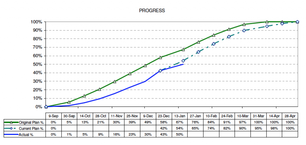
As you can see from the below S-curve example, this S is slightly less pronounced than the progress S-curve, which might be because the company has planned and aimed for more linear cash flows, which are easier to manage.
In this specific example, the actual cash flows are below the original planned cash flows, and as we can see from the actuals, the line has deviated away from the original plan and current plan. This highlights the volatility of even the most predictable S-curves, with sharp deviations which destroy our perfect S-curve being entirely possible at any stage of a project.

S-curve example for quantity output comparison
In the first of the S-curve examples, we looked at tracking overall project progress. But we can of course break overall project progress into specific production activities.
For example, progress on the construction of a road could be summarised in an overall S-curve, but we will likely have separate S-curves for tracking specific activities like the laying of asphalt.
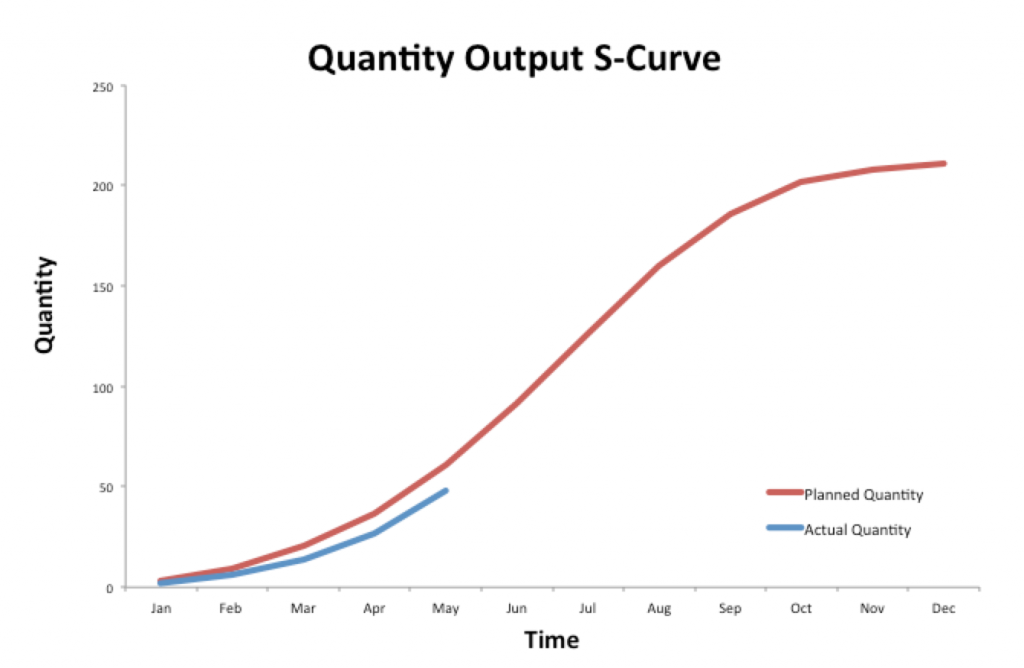
If we have 2km of road which needs laying, then this activity can be plotted on an S-curve too.
In this S-curve example, the timescale is quite long for a specific activity (12 months), so this activity is tracking quite well. The curve is following our initial projection quite closely, and we can likely increase the steepness of that curve to get in-line with our forecast once we are a few months in and production is reliable and predictable. We can then throw a few extra resources at the job to get it on schedule.
Similarly, if our production drops suddenly or deviates from our original S-curve, we will be able to quickly visualise that and make the necessary course-corrections.
As you can imagine, you could have many S-curves that look like this S-curve example to keep close tabs on specific activities. If you can keep every task or job on track, then the overall S-curve takes care of itself.

How to manage, track and update any S-curve
Project management theory explains S-curves really well, and S-curve examples help us to understand how they are used and what they look like.
But how do we actually create, manage and update S-curves in real-life over the course of a project?
There are two main ways that we can go about setting up and tracking S-curves on typical projects:
- Excel and manual data entry
- Project management tools and softwares
Excel is the traditional approach to S-curves for most projects, with project managers building a table with two variables (time and the resource being tracked over time), and then plotting those variables on a scatter plot graph or line graph.
The project manager will then create a new variable with 'actuals' as the project begins and progresses, and the new actual line will begin to reveal itself.
The main problem with using excel for any of the above S-curve examples (or any S-curve) is that it becomes really difficult to manage the S-curve data once the project begins. All of the good and accurate project data is being collected on site in other document types like PDF or paper. The project manager then needs to have all of this data sent to them before they convert it into their excel sheet and plot it on their S-curve. This requires a lot of admin, and also results in the low movement of data whereby data is delayed and therefore not as accurate.
The weakness of excel for S-curves has given way to the strengths of dedicated project management softwares and S-curve tools in recent years.
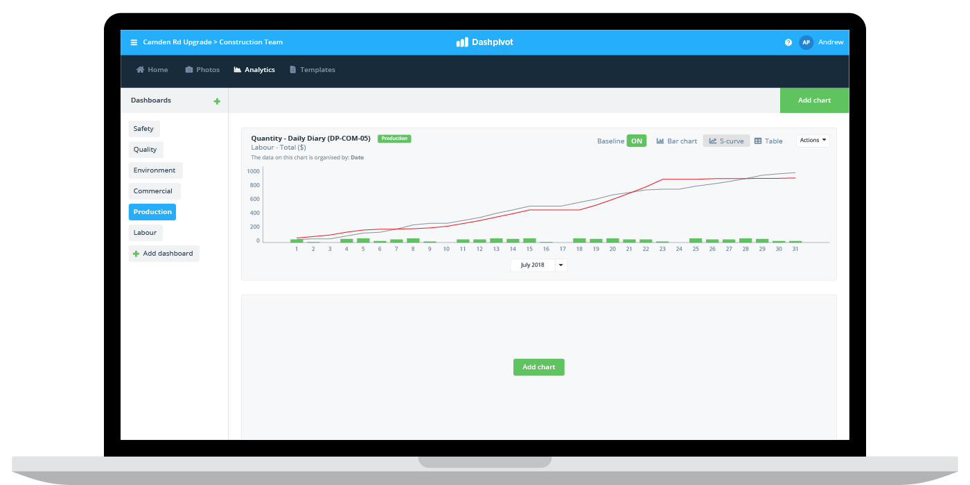
These softwares enable a project manager to set their baselines in the software, and then collect data in real-time as the project progress on site. This has been made possible by mobile technology, whereby workers on site can enter production and cost information into their mobile devices which is instantly synced to the cloud.
This data is then piped straight into tables, dashboards and S-curve charts so that the project manager can track all of the required detail in real-time.
This really streamlines information flow, reduces friction and ensures all of the data in your S-curves is accurate and reliable.
No matter how you choose to create and maintain your S-curves, hopefully these S-curve examples have given you some good insight and ammunition for building your own S-curves and staying on top of your projects.

People in 80+ countries use this software to track and understand project performance in real-time.
