Safety – Safety dashboards

Safety dashboards: Here's what you need to know
Safety dashboard examples
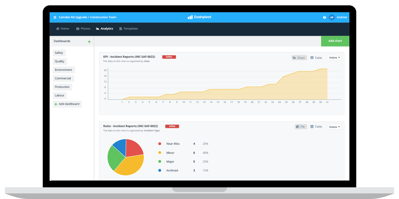
The first safety dashboard example below is an incident dashboard. As you can see, this dashboard was created or 'selected' in a designated system which automatically aggregates and formats the data into different types of charts and graphs.
For example, the top chart is showcasing the number of incident reports created over the course of a project, while the bottom graph is showcasing the ration of outcomes stemming from those incident reports.
In a system like this (or if you are using excel), it's really helpful to segment or categorise your different types of safety activities into separate dashboards. Rather than having all of your incident, hazard and other information in one place - you should segment your data into specific dashboards.
In the example below, you can see that there are even specific environmental and production dashboards as well.

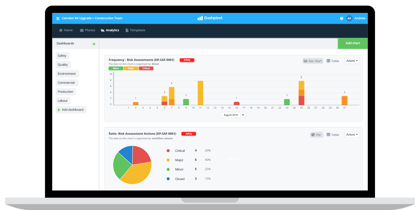
The next safety dashboard example below is for risk assessments.
Similar to the above example, the bottom graph in this case is showcasing the ration of risk assessment outcomes over a designated period of time.
The pie chart shows the ratio of risk assessment which returned minor, major or critical issues.
This type of data is great for risk assessment and analysis on a macro level, enabling a company to assess the risk of specific projects and activities against others.
The top graph is a slight variation on this below graph, and shows the number of risk assessments per day and the results of those assessments.
Displaying this information on a horizontal axis like this enables a company or safety team to spot 'spikes' in critical risks, which may help them decide which parts of their projects carry the most risk etc.
As you can see, the flexibility of these safety dashboards is extensive, and using a dedicated system like this enables teams to focus on the information in the dashboards - rather than assembling, formatting and double-checking the actual data.

How to create safety dashboards
There are two main way to create safety dashboards:
- To create your own manual safety dashboards in excel
- To create safety dashboards in a designated software/system
Many companies and projects still rely on excel for their safety dashboards, and have been able to take advantage of safety dashboard excel templates to give themselves a good foundation.
Many other companies have moved their safety dashboards away from more manual methods like excel to dedicated safety softwares which come pre-built with safety dashboard features and functionality.
The obvious benefits of using one of these dedicated safety dashboard systems is that it dramatically reduces the time people need to spend formatting spreadsheets and reconciling data - by automating most of this work.
The main benefits of excel-based safety dashboards is that everyone is comfortable with excel, and that there is no transition to a new system or software.
Below, we have outlined a couple of safety dashboard examples which are built in and maintained with Dashpivot.
Learn more about this safety dashboard software.
What needs to be in a safety dashboard?
When we talk about safety dashboards, we are most often talking about industries like construction, oil and gas, mining, manufacturing, agriculture and a few other heavy industries.
While safety is important in every workplace, it's a much more urgent and relevant concern on industrial sites where workers are dealing with heavy machinery, constantly changing environments and thousands of moving parts.
So what needs to be in a safety dashboard across these industries?
Some of the most common safety dashboards include:
Hazards
Hazard identification is one of the most important parts of workplace and site safety because identifying and understanding hazards is the easiest way to prevent hazards from turning into incidents.
A 'hazard' safety dashboard can show a company or project where the most hazards have been identified, what types of hazards are being identified, and the severity of those hazards.
This enables a safety team or the project to spot trends and patterns in the hazards and put processes in place to resolve them quickly.
Risk assessments
Risk assessments are another really important proactive measure which can dramatically reduce avoidable safety issues.
A good risk assessment safety dashboard will provide details on:
- The number of risk assessments being conducted
- The average score of those risk assessments
- Risk ratings by category
- Risk assessments completed (and by date and location)
- The type of risks being identified
Similar to a hazard dashboard, this enables a company or project to make smarter decisions about how to minimise the type of risks occurring on projects, or spot any issues in their risk assessment procedures or participation from site to site.
Incidents
Incidents are at the core of workplace safety and safety dashboards.
Incidents are the thing which all companies and projects are trying to avoid, and also the thing which companies need to be acutely aware of when they do happen.
A good incident safety dashboard will include information on the incident/near miss count by location, lost time from incidents, root cause analytics and the type of corrective actions made.
All of this information helps in spending time on more productive incident investigations - and being able to make more informed decisions about how to avoid incidents in the future.
Safety inspections
Some of the more simple safety dashboards enable companies and teams to see whether or not safety 'activity' is meeting the required standards.
A great and useful safety dashboard for any company is a safety inspection dashboard which shows the number of inspections being completed and the outcome of those inspections in a quantitative way.
This enables them to spot any sites or projects which are not engaging in enough inspections, and to easily see sites or projects where the outcomes of those inspections are consistently worrying.
Safety permitting
Safety permitting is extremely important in many industries. For inherently dangerous and high consequences activities like hot works and excavating, safety permits are essential.
A safety dashboard on safety permits shows the relevant people how many permits are open, how many are expired or expiring, and where permits are being held up at the moment.
Even though these are the most common and 'standard' safety dashboards you will see on most projects and for most companies, there is actually no limit on the number and type of safety dashboard which can be created and maintained - depending on the flexibility and smarts behind the company's safety management system.
A flexible safety management system makes getting more granular analytics and dashboards for toolbox talks, safety reporting, inductions and pre-qualifications and more possible and relatively easy.
So what are the ways in which these safety dashboards can be created, and what are the pros and cons of these setups.
Why are safety dashboards important?
Before we ask why safety dashboards are important, let's quickly clarify what a safety dashboard actually is - because it can be a confusing and broad term for many people and companies.
A safety dashboard is a visual representation of safety 'data' or relevant safety information, which enables a person, team or company to drill down into trends and patterns, understand what's happening, and ultimately make better decisions moving forward.
For the majority of companies, safety dashboards serve as their most comprehensive self-auditing tool, enabling them to spot safety issues and rectify problems before they become more severe issues - and before they get caught or surfaced by an external auditor.
In a world of big data, where more and more information (from a safety, commercial, environmental, quality etc. perspective) is being collected on site than ever before, dashboards are by far the best way to aggregate and display this data in a way which makes it digestible and actionable.
Without good safety dashboards, companies risk collecting and aggregating data for the sake of it and missing important insights and trends. While companies can often get away with this for some amount of time, eventually it catches up with them and those negative signs and trends end up causing a catastrophic incident or accident which cannot be undone - but which could have been prevented.
Because of the sheer amount of data being collected today - and because of the increased scrutiny placed on workplace and project safety - it's critical that workers and companies have the safety dashboards and other safety tools in place to make good decisions and mitigate as much of this risk as possible.
How to manage and maintain safety dashboards...
One of the hardest and most frustrating parts of safety dashboards is having to maintain and update them.
But these admin headaches only exist for companies who still rely on the manual excel safety dashboards.
Because excel or other spreadsheet based systems aren't directly linked to the safety data being captured on site with forms, apps and other tools, a person or people need to spend significant time chasing this data up and reconciling it into the tables which then inform the graphs and dashboards built in excel.
Using a dedicated safety dashboard system or smart safety system, the data being collected on site or in the workplace is instantly and automatically aggregated - because it is connected within the same system and is fully portable.
For example, the incident notification form which was exported as a hard copy below, was documented using an app. All of this data is pushed into a database which then fills your dashboards and graphs in real-time.
So once you have created and setup the charts and dashboards you want, they will be updated automatically in real-time as more and more data is being collected.
If your safety or admin teams spend hours at the end of the week or end of a project trying to collect and display data - then moving to a more fluid system comes with some incredible benefits including a dramatic reduction in 'wasted' time and faster insights from site.
Using the right digital tool, you can have the best of both worlds: real-time data and no formatting - and paper-based documents and records which look great.

What to do with the information from your safety dashboards
Companies are assembling a lot of data in today's world. And more and more data will continue to be collected in the years to come with new tools and technologies making it easier and easier.
It's easy for workers and companies to get caught up in all of this data and lose sight of the purpose of it.
Pretty safety dashboards and graphs serve one main purpose:
To provide a company and its workers with more useful information, so that they can make more informed decisions about what to do to improve safety outcomes.
Every time you look at a safety dashboard or talk through a safety dashboard, the end goal is to:
- Pull valuable information from them
- Turn this information into useful and actionable insight
- To action these insights and put better processes and procedures in place
If your safety dashboards can stay grounded in this, you will be well on your way to improving safety outcomes on your projects and at your organisation.
People in 80+ countries use this safety management system and these safety dashboards to improve their safety outcomes.

