Safety – Safety dashboard template

Safety dashboard template
A word on why you shouldn't use those excel based safety templates
Excel based safety dashboards were the best and most effective way to track safety number and metrics for many years. Companies could download excel safety dashboard templates and begin filling them out and updating them as new data and information flowed in from site.
From here, they could create excel-based 'dashboards' and charts which they could update by manually entering new information.
While this still is more effective than not tracking safety metrics, it takes companies, teams and workers a really long time to reconcile, manage and format all of this data in spreadsheets.
Many projects and companies have entire teams looking after all of this information and these dashboards.
Today, there is a much more efficient way to build and maintain safety dashboards. These 'new' safety dashboards can be created in seconds, show real-time data instead of lagging data, and require no additional maintenance and ongoing manual data entry or formatting.
So we are going to introduce these new safety dashboards by showing you a safety dashboard template and then some safety dashboard examples which you can follow to create your own custom dashboards.
An easy to follow template for creating real-time and automated health and safety dashboards
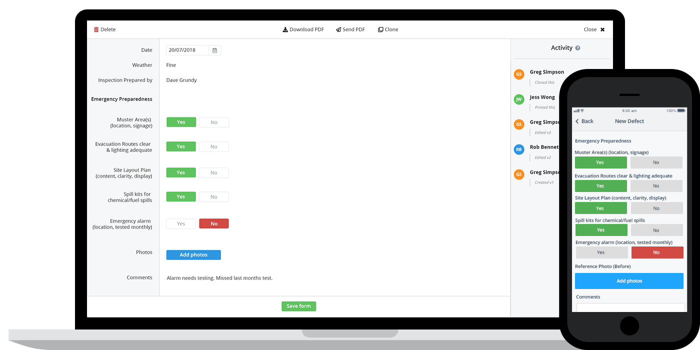
Step 1 - Capture safety data using a digital solution
The first step in transitioning your excel based safety dashboard templates across to fully digital dashboard templates lies in transitioning how you capture safety data and fill in safety forms on site.
It's impossible to create real-time and automated safety dashboards without real-time information capture. Using paper, word docs, PDFs and excel spreadsheets to document what's happening on site is the source of all of that manual data entry.
People can capture information fine, but then it needs to be scanned or uploaded, sent, and then reconciled.
So we need to change the 'source' of the information and make it digital - which is typically done through a site-based app and digital system.
Some companies have already started to use 'mobile' data capture software and apps to do this, but those apps also have to be connected to a database which informs the dashboards.
Using a standalone safety app which simply enables the collection of data will still result in the same problem.
Even if you are 'paperless', you will still have to export the data from the app and then place that data into a CSV or spreadsheet to turn it into useful information.
It still requires manual steps and manual data reconciliation, which is what we are trying to avoid with this 'template'.
Step 2 - Setup your own custom safety dashboards templates and charts
Once you are collecting data in this way, if the system you use is interoperable with the dashboards you are going to use (meaning the data can 'talk' to the dashboards and transfer the data without being changed or re-formatted manually), the only step you have to take is in funnelling that information into the right places.
In a system like Dashpivot, this means that the second step of this template is to setup the dashboards and charts you way you want.
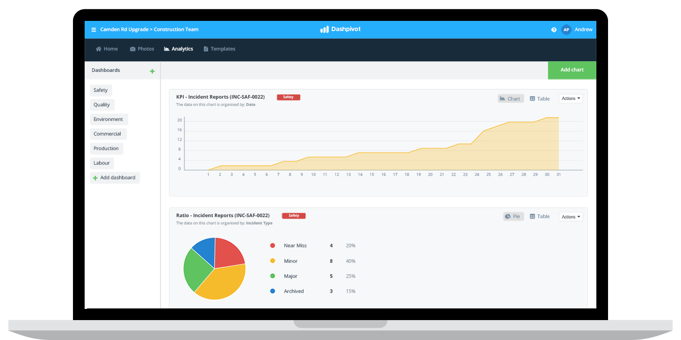
For example, if you want to create a dashboard which shows you how many safety inspections have been conducted, you just need to create a safety dashboard with a chart which references your safety inspection form.
Once you have taken this step, the data from the reference form will be constantly fed straight into the chart - which updates in real-time.
The system automatically aggregates and organise the information for you - instead of humans having to sift through manual forms and records.
You can create multiple dashboard templates, and reference whatever data and form you like. You may have a dashboard for safety incidents which has charts for the number of incidents and types of incidents.
Then you might have a hazard dashboard with similar charts for understanding and calculating the same counts and rations.
These dashboards are as flexible as the information you capture, and you can organise them as you see fit.
Step 3 - Use that data to make more informed decisions
The last step of this safety dashboard template is then being able to understand what to do with all of this safety data.
And whether or not you use free excel templates or a dedicated solution, this is the most important part of your dashboards.
In order to get the most out of these dashboards, you will want to set and measure some key performance indicators across health and safety.
These indicators or 'KPIs' enable you to understand how you are performing, how your performance can be improved, and how it has improved to date.
Without setting and measuring against these KPIs, it's extremely difficult to make informed decisions, and even more difficult to understand whether those decisions are resulting in favourable outcomes.
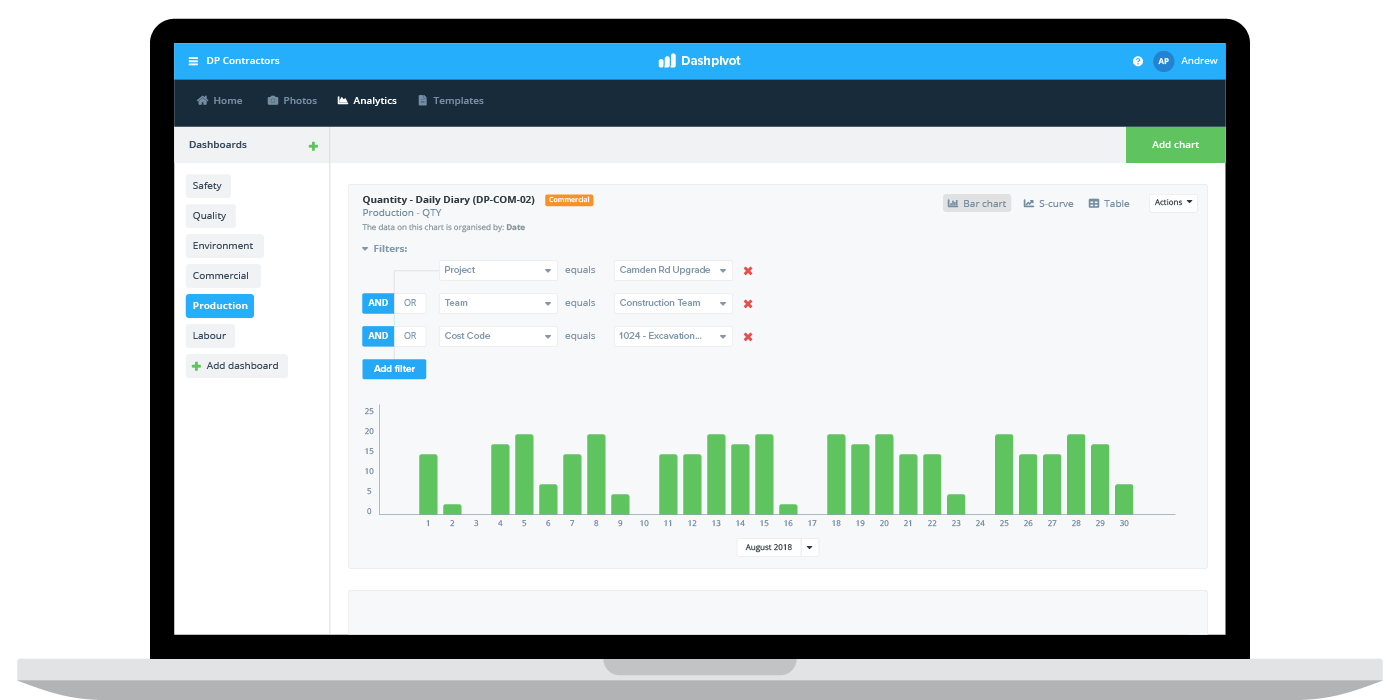
From a mechanics standpoint, using the system, you can drill down into specific charts and dashboards to get more granular on what's happening, who it's happening to, and why it's happening.
Follow this smart safety dashboard template now.
Safety dashboard examples which were created following this safety dashboard template
Risk assessments
Assessing risks in heavy industries like construction, oil and gas and mining is critical to project and company success.
Risk assessments are a proactive measure for ensuring people are making good and conscious decisions about how to move forward with some form or activity - or even an entire project.
Following the safety dashboard template above, you can quickly and easily create safety dashboards which illustrate risks on certain projects, sites and activities.
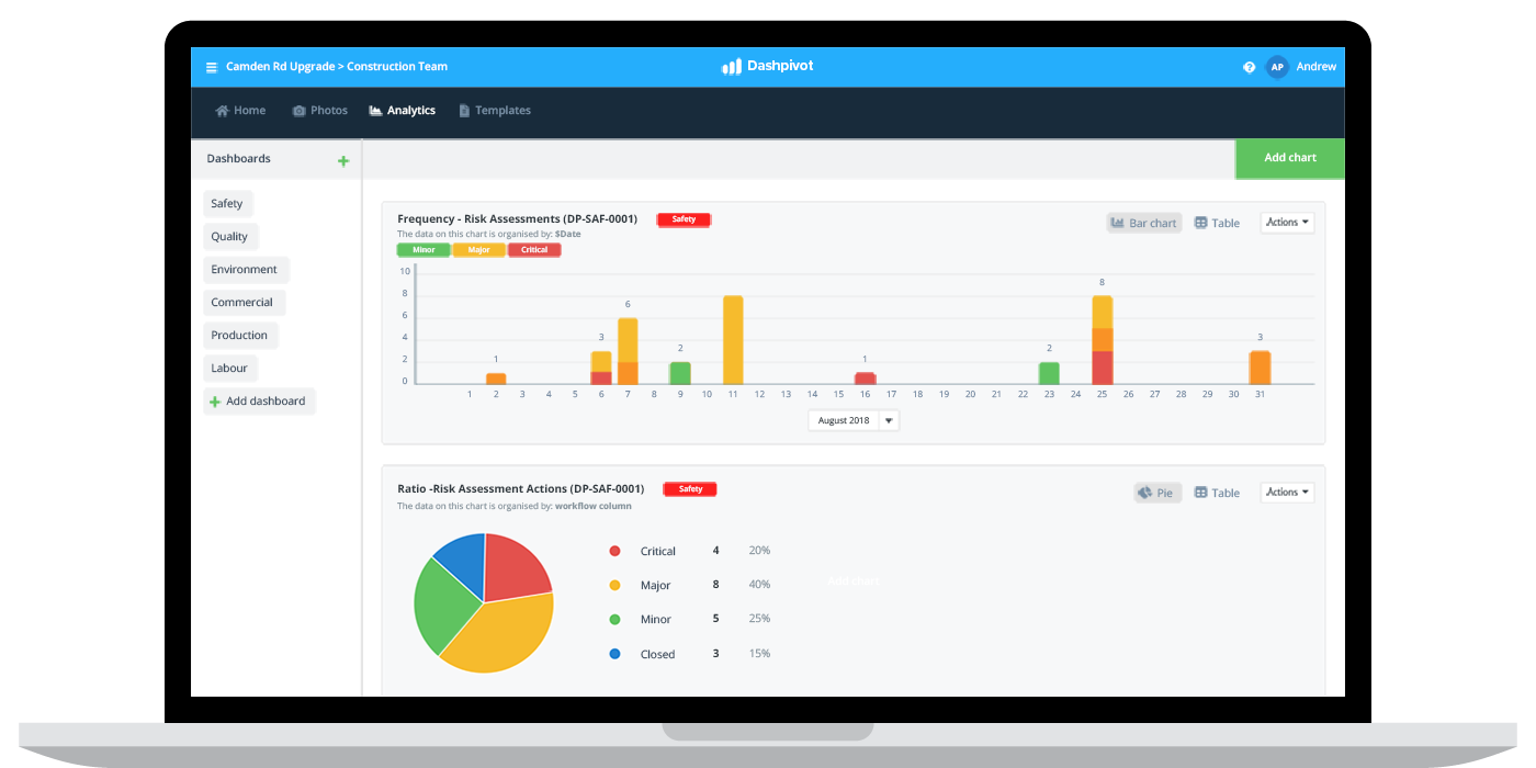
As you can see in the safety dashboard example below, there are a couple of example charts:
- One for measuring the frequency of risk assessments which can show safety and risk assessment participation
- One of measuring the ratio of types of risk on a specific project or activity, which helps companies better understand their risk profile
Safety audits and inspections
The number of safety inspections and audits being performed on a project or site is a very typical and helpful safety dashboard chart or metric.
Similar to risk assessments above, audits and inspections are a powerful leading indicator (described in this safety metrics examples article) for understanding the culture of safety at your organisation.
If the number and frequency of inspections and audits is equal to or more than what you expect and if your safety performance is good, then you know you are performing and managing safety well.
If the number of inspections is dropping or is low on specific teams or sites, then you may have some cultural issues to sort out.
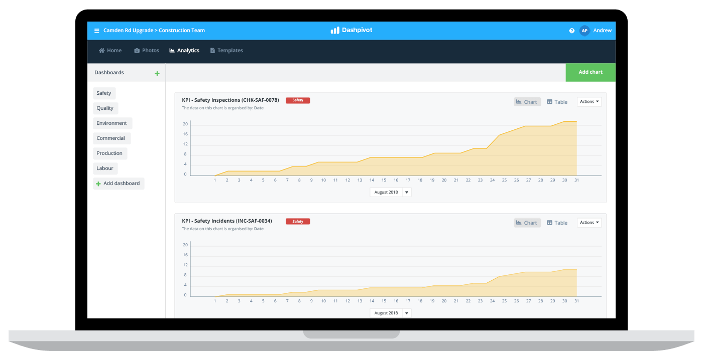
Incidents
The last safety dashboard example we will look at is the most common and most referenced dashboard of all - incidents.
Like the other dashboard examples, incidents can be best followed and tracked using the above safety dashboard template.
This enables companies and projects to track this key metric over time and measure it against industry and company benchmarks.
Some of the charts which are most useful in this dashboard include the number of incidents which have occurred, the ratio or types of incidents occurring and where they have occurred.
A couple of these charts are illustrated in the example below.

Creating accurate and reliable safety dashboards is critical to safety performance over time. These dashboards are the 'tools' you can use to create change and improvements in your safety processes and procedures which impact outcomes directly.
Many companies still face obvious challenges when creating and maintaining these dashboards, but by following the above safety dashboard template and using a smarter safety management system (you can try this template and these examples for free), you will be getting real-time and accurate data without breaking a sweat or wasting any resources.
People in 80+ countries use this safety management system to build real-time and accurate safety dashboards.
