Safety – Safety KPI scorecard

Safety scorecard examples, explanations and templates
What is a safety scorecard?
A safety scorecard is a combination of safety metrics displayed in a digestible format which can be viewed and analysed to understand safety performance. The purpose of this scorecard is to spot trends, issues and opportunities for improvement, and use that data to make more informed decisions about exactly how to improve.
For many companies, the safety scorecard serves as the source of truth for safety resourcing and strategy.
Almost all companies have struggled to measure and track safety performance in a consistent and accurate manner. And this has made it really difficult for companies to make improvements to their safety plans and safety management system.
While some improvements were no brainers, others are less obvious, and a lack of good and reliable data has stifled a lot of innovation and improvement in this area of work.
The safety scorecard, while not perfect, has often resulted in a more comprehensive and balanced analysis (hence the balanced safety scorecard). Instead of measuring safety performance based on a single KPI like total recordable injury rate (here are a bunch of KPI's), the safety scorecard creates a more holistic approach to understanding organisational or project safety.
What should be on your scorecard?
The exact make up of your safety scorecard will depend on a number of factors, as well as your current safety performance and safety goals. What's in or on your safety scorecard will depend on a few factors including:
- The type of work you conduct
- The industry you operate in
- Your access to good data
But generally speaking, there are some key safety metrics which most companies will want to (and should) include:
- Safety exposure or leading indicator metrics including:
- Number of safety training hours
- Number of safety permits created and approved
- Work hours
- Safety control metrics including:
- Inspections completed (planned vs. actual)
- Safety audits
- Lagging indicators like:
- lost time injury rates
- Total case incident rate
- Precursor events including:
- Equipment failures
- Near misses
The other thing to always keep in mind when preparing and managing your safety scorecard is that more is not always better.
The whole point of your safety scorecard is to distill all of your information and data into a single point of understanding. If your scorecard gets too complicated, then you will have information overload and find it really difficult to priorities and ultimately make good decisions.
A complicated and too-comprehensive safety scorecard will also be almost impossible to update and maintain, and will take a huge amount of time away from doing valuable activities. You have to find the right balance between understanding what's happening and having the time to make improvements.
Understanding the safety information which is most important to your business and teams is half of the battle when it comes to safety scorecards.
Safety scorecard examples
So now that we know what types of things you should be thinking about tracking on your safety scorecard, let's take a look at some safety scorecard examples.
This specific safety scorecard (powered by Sitemate) is broken down into two dashboards and multiple charts.
The two dashboards are:
- Leading indicator scorecard
- Lagging indicator scorecard
And the individual charts within these dashboards are covering specific types of those indicators.
Safety leading indicators scorecard
Below is an example of a safety leading indicator scoreboard.
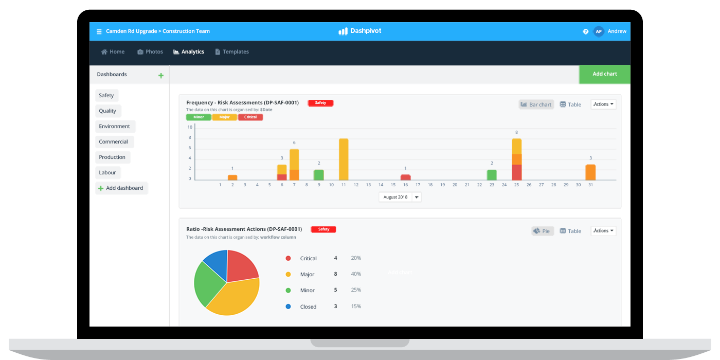
In this example, a construction company is using their scorecard to track the number and type of risk assessments being performed. Risk assessments are a leading indicator, because conducting more risk assessments today should result in less accidents and incidents in the future.
The example scorecard below shows a frequency chart in the top section, which displays the number of risk assessments which have been performed in the last 30 days and a ratio chart, which shows the outcome of those risk assessments in terms of whether or not they were critical, major or minor.
Below this, the company may have an additional couple of charts showing the safety manager or responsible person other leading indicators like the number of inspections being performed or the number of toolbox talks conducted.

Lagging indicators scorecard
The other major bucket of indicators for most companies are lagging indicators - which are so called because they display information from the past, which has little to no direct influence on future performance.
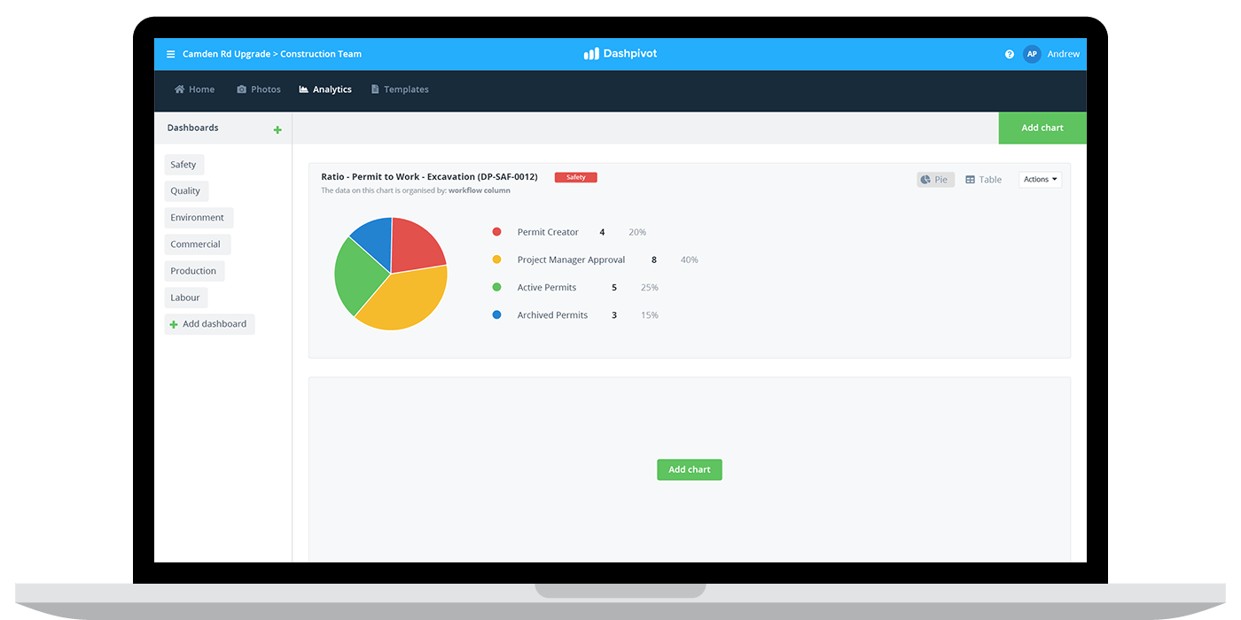
In the safety scorecard example below, the indicator being displayed is the number and type of accidents.
You can see the number and frequency of accidents is displayed in the top section, and the bottom section features the type of accident.
Segmenting a safety scorecard into digestible chunks is sometimes the best way to manage the 'whole' safety scorecard, because it enables the safety manager or safety team to compartmentalise safety activities - so that they can use and think about the levers they can use to effect those specific metrics.

Safety scorecard templates
Building a safety scorecard can be difficult for many companies. Even when you know what metrics you are looking to track on your scorecard, it can be difficult to build the framework and then create a way to effectively update and track it efficiently.
This is where safety scorecard templates become valuable.
There are a couple of good options when it comes to safety scorecard templates, and each has it's pros and cons.
Safety scorecard excel templates
The most 'traditionally' relied upon safety scorecard template has been the excel template.
Many companies use excel and spreadsheet based templates to create and manage their safety scorecard.
There are many benefits to this approach, including the fact that almost everyone has excel and it's really easy to pick and put some data in.
The major downside to an excel safety scorecard template is maintaining it over time. Because your excel based template won't be connected to the safety data being pulled in from the field, someone (maybe you) will have to compile and reconcile all of that data and then put it into a spreadsheet.
This can become extremely monotonous, especially when looking to update your safety scorecard regularly or when working on a project with hundreds of disparate documents.
Safety scorecard software-based templates
The other type of safety scorecard template which is becoming increasingly popular amongst companies is a software-based template.
These safety scorecard templates, like you saw above, are the bones which companies can use to build out proper scorecard dashboards and charts.
The major benefit to these types of templates and systems is that once you have your scorecard setup it takes care of itself.
The scorecards in these systems automatically aggregate and display the data being collected on site, so if you someone fills out an incident report, it will automatically feed into the dashboard and display in real-time.
This means there is no lag in the data so you can make quicker and more accurate decisions, and also that no one has to spend their time manually entering data and formatting excel spreadsheets.
The downside to these systems is of course that it requires a slight change in approach which can come with some level of friction, and that these softwares typically cost money. However, with subscription based pricing and no upfront costs, the costs of moving your processes to a more streamlined tool is lower than ever; not to mention the amount of money it saves in the medium and long term through greater efficiencies.

Use this system to maintain your safety scorecard in real-time.
The future of the safety balanced scorecard
Safety scorecards have improved quite dramatically since they become a core health and safety tool, from simple paper scorecards to pretty excel spreadsheets and now real-time dashboards.
The improvements in the scorecard are mirroring the improvements in safety outcomes and safety consciousness, with companies being more aware of safety performance than ever before.
The future of the safety balanced scorecard is more balanced and more useful.
For years, improvements in data capture meant that companies and projects had more information and more safety data, but they have always struggled to funnel that into a powerful safety scorecard.
New tools are making data capture even easier and more importantly automating the movement and standardisation of this data, which means the people looking at the safety scorecard and data can spend their team analysing it, discussing it and making decisions about where things can be improved.
As wearable technology and the Internet of Things becomes more practical and affordable, the data collection aspect of health and safety will also become largely automated.
Companies and projects will be able to setup a safety scorecard and watch as real-time data is fed in from site, equipment and their workforce. As long as all of this data can be sorted and displayed in a digestible format e.g the safety scorecard, companies will be able to make the type of quick decisions and course-corrections which will move the world towards zero harm.
Your safety scorecard is a powerful tool for 'scoring' safety performance - and one in which you should be thinking about and investing in today.
People in 80+ countries use this safety management system to update and manage their safety scorecard in real-time.
